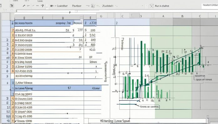
Learning to graph y=mx+b in Excel boosts your charting and math skills. This guide helps you from start to finish. It covers basic linear equations to Excel’s advanced graphing. It’s perfect for students, teachers, or anyone who wants to make data more informative.
To graph y mx b in Excel, knowing linear equations is key. First, we explain what these equations are. We detail the slope (m) and intercept (b). After that, we show you how to set up an Excel sheet. You’ll learn to use Excel to find the slope and y-intercept. Then, you’ll plot points and make a chart. We also talk about the LINEST function for deeper analysis.
Key Takeaways
- Understand the basic components of linear equations and their implications.
- Learn to set up an Excel spreadsheet specifically for graphing purposes.
- Master the use of Excel functions such as SLOPE and INTERCEPT for calculating crucial parameters.
- Gain proficiency in plotting points and creating clear, informative graphs.
- Explore the capabilities of the LINEST function for deeper statistical analysis.
Understanding the Basics of Linear Equations in Excel
Learning about linear equations in Excel starts with knowing what they are. It shows us their uses in math models. We’ll check out how they look with one or two variables, and what terms like slope and intercept mean.
Definition of Linear Equations in One and Two Variables
In maths, a linear equation in one variable uses ax + b = 0. Here, ‘a’ and ‘b’ are fixed numbers. If we move to two variables, something like Ax + By = C, we describe a line on a map. This helps us see connections between two changing things. Such equations are very handy for drawing graphs and looking at data in Excel.
The Role of Slope (m) and Intercept (b) in Y=MX+B
The slope in y=mx+b tells us how fast ‘y’ changes with ‘x’. This is key for guessing where data might go. The intercept, ‘b’, is where the line hits the y-axis when x is zero. It shows us the first point of data, like when we start reading a graph in Excel.
Using these numbers in Excel makes our graphs more accurate. This is very important for lots of jobs.
| Component | Role in Equation | Impact on Graph |
|---|---|---|
| Slope (m) | Rate of change of y per unit increase in x | Determines the steepness of the line |
| Intercept (b) | Initial value of y when x is zero | Defines where the line crosses the Y-axis |
How to Graph Y MX B in Excel
Graphing linear equations like Y=MX+B in Excel helps with data visualization. It also improves your skill in statistical analysis. This guide will show you how to turn data into clear graphs using different Excel features.
Setting Up Your Excel Sheet for Graphing
First, organize your Excel sheet well for entering data. You need columns for ‘x’ and ‘y’ values. This is the first step in making a solid linear graph.
Calculating Slope and Intercept Using Excel Functions
Now, let Excel do the work for calculating slope and intercept. Excel’s SLOPE function figures out the change in y for each x unit. The INTERCEPT function finds where the line crosses the Y-axis. This prepares your analysis for a close look at your data.
Plotting Points and Creating the Graph
Once you have set up your sheet, input your ‘x’ and ‘y’ values. Check carefully that your data is accurate. Then, you can make a scatter plot. After plotting your points, Excel helps draw the line. This makes your data easy to understand at a glance.
Formatting Your Graph for Better Visualization
Formatting your Excel graph makes it clearer and more visually appealing. You can change the axes’ scales, the line’s color, and add labels. These steps ensure your graph is not only good-looking but also easy to read and understand.
Using the LINEST Function for Detailed Regression Analysis
For advanced data checks, Excel’s LINEST function is key. It analyzes your data deeply. LINEST calculates slope and intercept, giving you their statistical meaning. This feature offers insights into how trustworthy your linear model is.
| Function | Description | Application in Graphing |
|---|---|---|
| SLOPE | Calculates the slope of the line | Used to determine the rate of change between variables |
| INTERCEPT | Calculates the y-intercept of the line | Identifies where the line crosses the Y-axis at x=0 |
| LINEST | Performs regression analysis | Provides detailed statistical analysis of the linear model |

Advanced Tips for Graphing Linear Equations in Excel
When graphing linear equations in Excel, adding more tools can make your charts better. One big tip is to handle data that doesn’t fit the usual y=mx+b trick. Try transforming the data or use Excel’s other tools for different patterns. This helps you dig deeper into complex data easily.
Dealing with outliers is also key to keeping your charts true. Outliers can mess up your line, making your info wrong. In Excel, you can spot these outliers with special colors easily. This way, you can either remove them or look closer. Also, using more than one variable can show more about how data interacts. Scatter plots with different sets on one chart can show clear links, boosting your analysis.
Customizing your graphs can also make a big difference. Excel lets you tweak lots of things like axes, lines, and markers. These tweaks make your charts look better and easier to understand. By learning these advanced graphing tricks, you can get more from your data. This makes your work more effective and engaging.


